I’ve worked with plenty of bare walls by starting simple—a single oversized piece grounds the space quickly.
Board and batten trim (around $15 for polished pieces) adds depth without much skill required.
Floating shelves at staggered heights turn dead space into functional display.
Wainscoting boxes create architectural bones for art or mirrors.
Gallery walls mix frame sizes for rhythm.
Layer in a furniture piece (60–100 inches wide) as your anchor, then add plants for vertical interest.
Each approach tackles the problem differently, so stick around to discover which fits your style.
Add Architectural Detail With Board and Batten Wall Trim
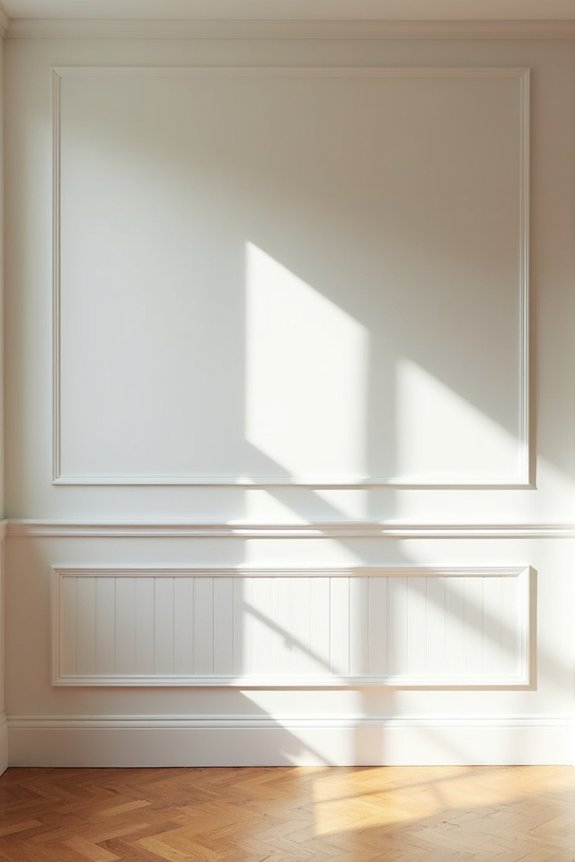
Why does a completely bare wall feel so empty, even when the rest of your room’s furnished and cozy? Board and batten trim creates visual interest on flat surfaces. This technique uses vertical battens paired with horizontal rails, producing depth and shadow that catch the light.
What makes this approach practical: minimal cost and skill required. A simple foyer application costs around $15 for polished trim. I recommend testing the installation first by placing a trim piece on the wall. If your walls have texture like orange peel, use caulk to smooth seams. You can extend this style from under stairs to adjacent walls, creating visual consistency throughout your space.
Planked and Shiplap Walls for Texture and Interest
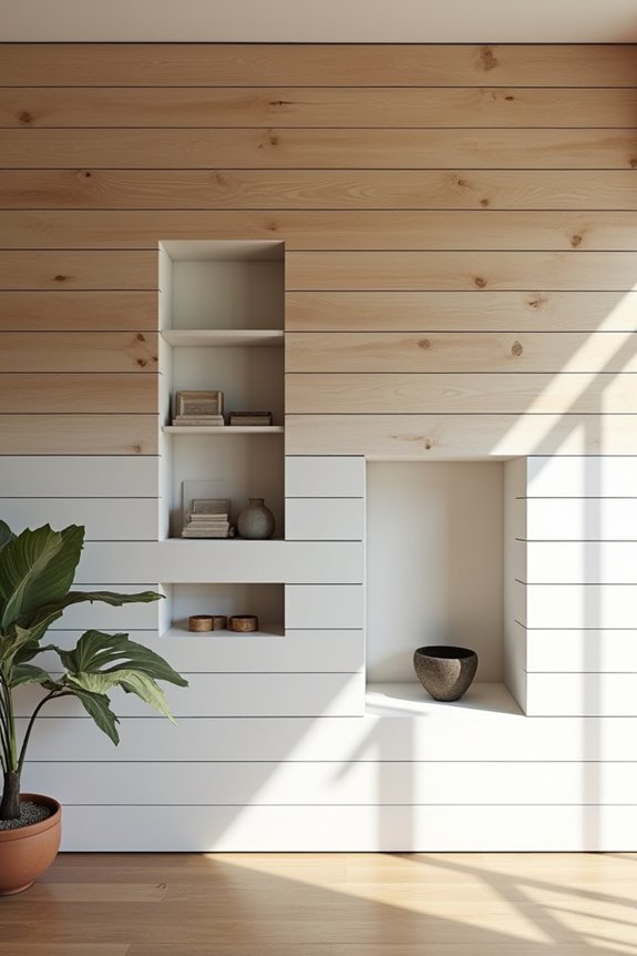
Planked and shiplap walls cover the entire surface with horizontal wood lines, creating depth and texture. This approach adds visual interest without overwhelming the space. When you stain planked walls, you introduce warmth and natural variation throughout the room. The horizontal lines guide your eye across the wall, creating a unified appearance.
| Finish Type | Best For | Visual Effect | Maintenance |
|---|---|---|---|
| Stained | Creating warmth | Natural depth | Annual sealing |
| Whitewashed | Modern look | Airy feeling | Light dusting |
| Natural wood | Rustic charm | Authentic texture | Occasional waxing |
| Painted | Bold statements | Clean lines | Easy touch-ups |
Planked walls work particularly well on stair walls or entryways, where they define the space with purpose.
Wainscoting Molding Boxes: Wall Character Without Clutter
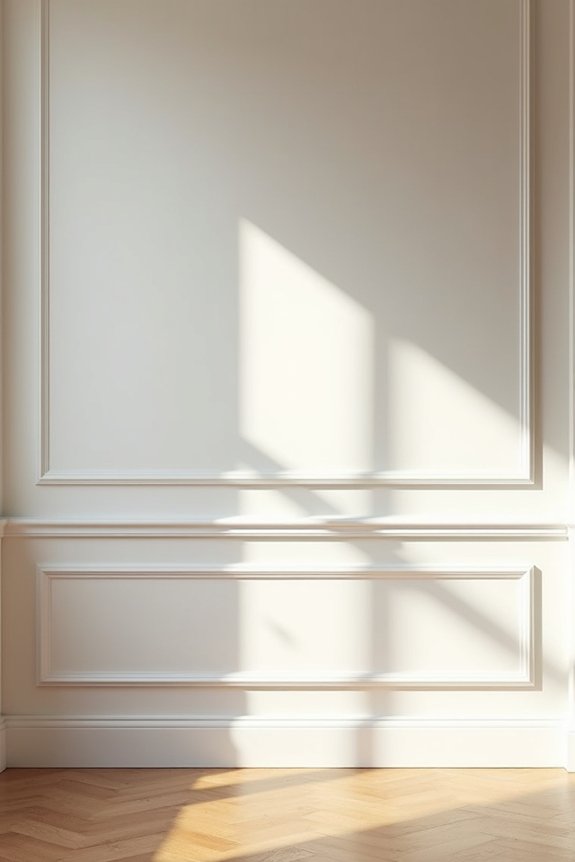
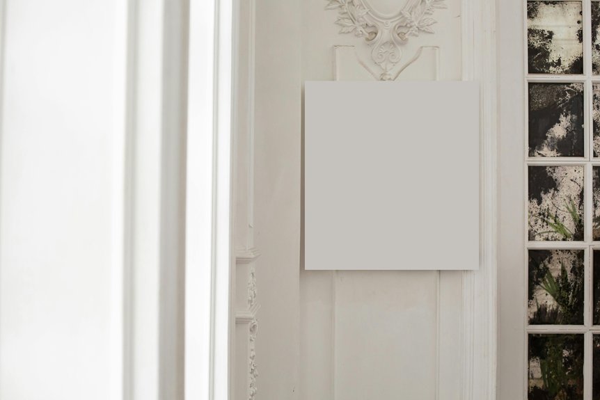
I’d suggest using wainscoting molding boxes to add real architectural bones to your living room wall without overwhelming the space with clutter. These simple geometric frames create natural spots where you can showcase a single piece of art or a mirror, letting each item have its own presence while adding visual interest and scale to tall or expansive walls. You’re using the molding itself as your design statement, which means you can keep the wall inside those boxes clean and simple—letting the structure do the work.
Creating Character With Boxes
If you’ve got a wall that feels too big and too bare, simple box trim is your answer. I’ve found that box molding creates architectural interest without overwhelming your space.
Here’s what makes this approach work so well:
- Defines empty wall space with added detail and proportion
- Provides a dedicated spot for art or mirrors to stand out
- Works beautifully on under-stair walls and multiple connected spaces
- Adds texture while keeping clutter minimal when paired with thoughtful lighting
Installation’s straightforward. You can apply caulk directly to textured surfaces, or attach a thin backer board first for cleaner results. I prefer the backer board method—it gives you better control and looks more polished. Box molding balances large rooms by breaking them into manageable visual sections. You’re creating architectural breathing room that ties your whole space together.
Strategic Art Placement Spots
Now that you’ve got those architectural boxes creating visual structure, you’ll want to think carefully about what goes inside them. I’ve found that strategic placement makes these wall compartments into genuine focal points. One medium-sized framed print or mirror per box prevents overcrowding while drawing your eye naturally through the room. Consider the scale: a small 16×20 frame fits perfectly in standard wainscoting boxes, while larger 24×36 pieces work better on expansive wall sections. Rotate your art seasonally to keep things fresh without redesigning. I like pairing a single artwork with negative space—it’s both calming and deliberate. This approach makes your wall feel organized rather than cluttered, turning those architectural boxes into purposeful display areas that anchor your living room.
Architectural Detail For Scale
Wainscoting molding boxes are a practical tool for making a sprawling, empty wall feel deliberate instead of bare. They divide vast spaces into organized sections without overwhelming the room.
Here’s why they work:
- They create natural frames for wall art display pieces you already own
- They establish visual rhythm across large, featureless expanses
- They pair well with shiplap or planked textures for consistency
- They define proportions in under-stair walls or foyers
Simple box trim—typically 3 to 4 inches wide—adds genuine dimension. You’re building architectural pockets that draw attention and anchor furniture arrangements. Rather than scattering décor randomly, these boxes give you dedicated spots for mirrors or framed art. The result? Your living room looks thoughtfully designed, not half-finished.
Make a Statement With Large-Scale Wall Art or Prints
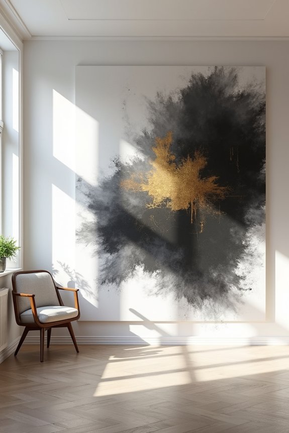
One oversized piece of art can refresh your empty wall quickly. I recommend starting with a single large-scale wall art piece—something that commands attention without overwhelming the space. This approach creates immediate visual interest while keeping things clean and organized.
When you’re selecting your piece, consider what sits below it. Pairing an oversized print with furniture underneath grounds the entire arrangement. You might also try stacking two or three frames symmetrically for added unity.
A large chalkboard or bulletin-board artwork serves both as decoration and practical display space. Think about your viewing distance too—larger pieces work best when you can step back and appreciate them fully from across the room.
Go Beyond One Piece: Build a Curated Gallery Wall
If you’re ready to fill that wall properly, you’ll want to think about balance—mixing different frame sizes and arranging them so your eye moves smoothly across the space rather than getting stuck in one spot. I’d start by picking frames that work together (think consistent wood tones or all black frames) and planning your layout on paper first, whether that’s a tight grid or a looser salon style that flows naturally from your seating area. The trick is treating your gallery like a conversation between pieces: each frame should have breathing room, but together they should feel connected and purposeful, not random.
Balance and Visual Rhythm
When you’ve got a blank wall staring at you, here’s what I’ve learned: cramming one massive piece in the center often leaves the rest feeling empty and awkward. Instead, I build a gallery wall with deliberate balance. Here’s my approach:
- Pair larger pieces with smaller accents to distribute visual weight evenly
- Repeat a color, texture, or motif throughout your arrangement for cohesion
- Leave breathing room—negative space keeps things from feeling cluttered
- Position art above furniture to create natural anchor points
I always test my layout on the floor first using tape outlines. This helps me see sightlines before I commit to nail holes. Lighting matters too—wall sconces add vertical rhythm and make the whole display feel more deliberate. That’s how you create a blank wall arrangement that actually works.
Frame Selection and Arrangement
How do you choose frames without ending up with a mismatched mess? Start by picking one dominant piece—something 24 to 36 inches—then build around it with medium and small frames. This creates balance without overwhelming your space.
Here’s where spacing and arrangement matter most. Lay paper cutouts on your wall first, testing different layouts before committing. This simple trick prevents mistakes. Keep spacing consistent using wall-marking strategies like an art rail, which aligns frames well.
Mix your frames, but stay cohesive through matting colors or finishes. Consider picture ledges too—they work well for rearranging without new wall holes. Your arrangement should feel deliberate, not random, creating that organized gallery-wall look that ties your room together.
Introduce Color and Pattern With Wallpapered Accent Walls
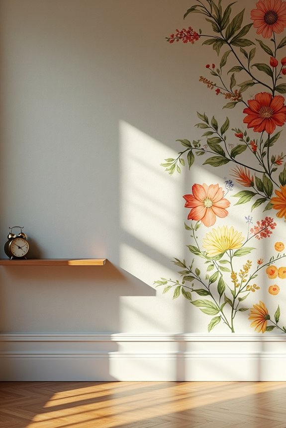
Why settle for blank walls when wallpaper can change your living room in ways paint simply can’t?
I’ve found that wallpaper introduces color and pattern without cluttering your space with additional frames or artwork. Here’s what makes it work:
- Peel-and-stick options let you change your look whenever you want without commitment
- Real wallpaper provides durable texture that adds visual interest
- Bold patterns create focal points that ground your room’s design
- Cost-effective choices keep expenses reasonable
When selecting wallpaper for a dominant wall, aim for designs that complement your existing colors and textures. This keeps everything feeling cohesive rather than chaotic. The beauty? You’re introducing personality and depth through one strategic wall. That’s practical design.
Add Floating Shelves for Wall Display and Storage
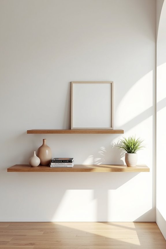
Floating shelves let you turn a bare wall into a functional display that shows off your style—books, plants, and art all working together without weighing down your space. Vary your shelf heights and lengths to create visual interest and balance, mirroring your furniture arrangement so everything feels deliberate. To make it look polished, choose bracket styles and shelf finishes that match your existing decor, then rotate seasonal items to keep the display fresh.
Styling And Layering Shelves
When you’ve got a cavernous living room wall staring back at you, shelves are one of the smartest moves you can make. Here’s how I’d layer them for maximum impact:
- Mix shelf depths between 8–12 inches to create visual rhythm
- Stagger heights and align with your sofa or console lines
- Combine art, books, plants, and small decor in balanced vignettes
- Add LED lighting or sconces to highlight your displays
Floating shelves work because they don’t feel heavy or cluttered when you’re intentional about spacing. I’d avoid lining everything up like soldiers—that’s boring. Instead, anchor mirrors or artwork between units as focal points. Your wall goes from empty to thoughtfully designed without demanding attention.
Functional Display And Storage
The beauty of shelves is that they pull double duty—they’re not just about showing off your favorite art or books, they’re also practical storage that doesn’t eat up your floor space. I’ve found that mixing shelf lengths at staggered heights keeps things visually interesting while maintaining open sightlines throughout the room.
| Shelf Feature | Benefit |
|---|---|
| Sturdy wall anchors | Secure support for heavier items |
| Backer boards | Extra reinforcement on textured walls |
| LED strip lighting | Highlights displayed items beautifully |
| Mixed heights | Creates visual depth and interest |
| Lightweight decor | Prevents cluttered, balanced appearance |
When arranging your shelving, I recommend pairing books with framed pieces and decorative objects strategically. This approach prevents overcrowding while maximizing functionality. Consider adding LED puck lights underneath to highlight your collection and create ambient illumination that improves the overall appearance of the space.
Anchor Your Wall With a Statement Furniture Piece
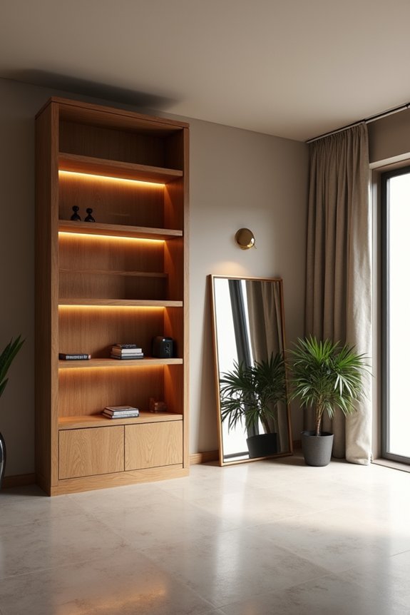
Ever notice how an empty wall feels incomplete until you give it something substantial to stand on? I’ve learned that anchoring a big wall with statement furniture changes the entire room’s dynamic. Here’s what I recommend:
An empty wall feels incomplete until you anchor it with substantial statement furniture that transforms your room’s entire dynamic.
- Place a credenza or tall storage cabinet (60–100 inches wide) centered on the wall
- Add a dramatic mirror or prominent artwork directly above the furniture piece
- Layer in a sculptural lamp and small plant for vertical interest
- Keep surrounding décor minimal and cohesive in color
This approach creates balance and purpose. The large furniture piece becomes your primary visual anchor, drawing the eye naturally. When you surround it with deliberate spacing and complementary décor, your wall goes from forgettable to memorable. You’re building a vignette that feels considered, not random.
Go Tall With Plants to Fill Vertical Wall Space
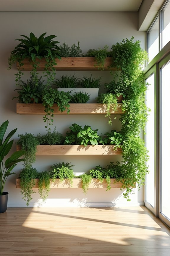
If you’ve anchored your wall with furniture, you might notice there’s still plenty of vertical real estate above and around it—and that’s where tall plants come in. I find that grouping columnar plants like Dracaena, Yucca, or fiddle-leaf fig in a staggered line draws the eye upward, creating the illusion of higher ceilings. You’re building height without clutter. Arrange them in a curved arc for organic movement that feels natural and deliberate.
For low-light spaces, I’d recommend shade-tolerant varieties like snake plant or ZZ plant paired with grow lights to keep things lush. Wall-adjacent hanging systems or vertical shelves maximize reach while keeping your floor clear for furniture flow. Trim lower foliage on floor plants to maintain open sightlines. This approach uses empty wall space as a living, breathing focal point.
Use Mirrors and Lighting to Enhance Your Wall
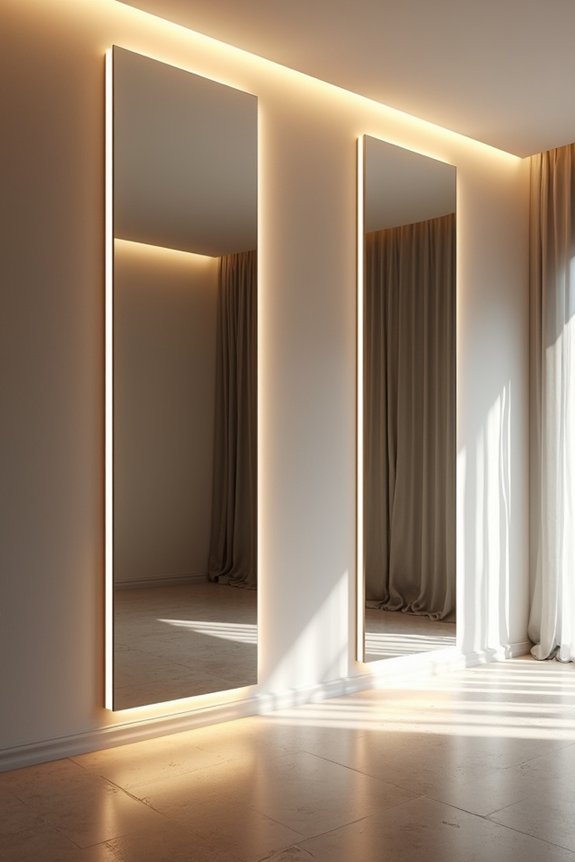
While plants draw the eye upward, mirrors and strategic lighting also work effectively—they expand your space and create dimension on that blank wall.
Mirrors are highly functional in a living room. A large wall mirror can visually double your space and bounce light around, making everything feel brighter. Here’s what I recommend:
- Position a tall, floor-to-ceiling mirror on an adjacent wall to balance proportions
- Install dimmable LED lighting behind the mirror frame for ambiance
- Use wall sconces to illuminate mirror edges and create depth
- Cluster multiple mirrors as a gallery focal point without adding clutter
The right lighting setup changes your wall from flat and boring into something genuinely inviting. Pairing mirrors with strategic illumination gives you a sophisticated look that works well in any room.