
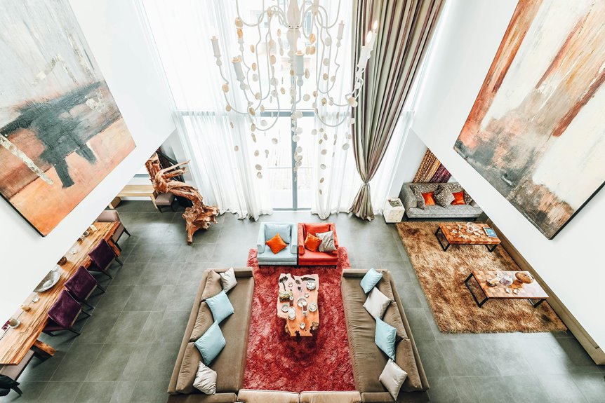
Start by considering what mood you want when you walk in—calm, modern, or bold. Your walls become the foundation for everything else. Test paint samples on your actual walls at different times of day because light shifts color dramatically. Soft neutrals like Dover White create versatile backdrops, while inky blues or grounding greens add personality. The right finish matters too; matte or satin preserves color depth better than glossy. Understanding how these elements work together reveals why some spaces feel just right.
Set the Living Room Mood You Want to Create
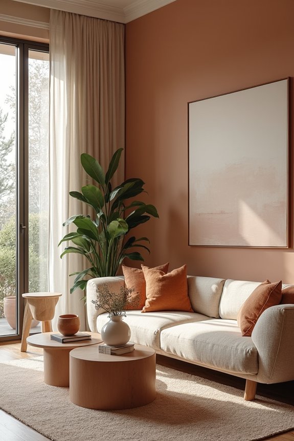
What’s the first thing you want to feel when you walk into your living room? That’s your starting point for picking paint colors. Your living room mood sets the entire tone for how you’ll use and enjoy the space.
If you’re after relaxed casual vibes, you’ll want softer, muted tones. Craving modern polished? Think crisp, clean neutrals. Prefer warm comfort? Lean into earthy, embracing hues.
I’ve found that identifying your desired mood first makes color selection straightforward. You’re not just picking random shades; you’re building an environment that works for how you actually want to feel at home. Your walls become the foundation for everything else—furniture, decor, lighting—so getting this mood decision right matters.
How Light Shapes Your Color Choice

Why does that gorgeous paint color you loved in the store look completely different on your living room wall? Light changes color in ways we don’t always anticipate. I’ve learned that lighting analysis matters more than I realized.
Light changes color in ways we don’t anticipate—lighting analysis matters far more than most realize.
Here’s what shapes your color choice:
- Natural light direction – Southern or western exposure makes colors appear cooler; northern light can warm them up
- Room brightness levels – Sunlit spaces handle saturated colors better; dim rooms need lighter or warmer tones
- Time of day – Colors shift from morning through evening, so check samples at different times
- Lighting type – Premium finishes like Aura Interior help reduce color shifts from various light sources
- Existing decor – Pair your color with your lighting plan to keep shades true from day to night
Test samples under your actual conditions before committing.
Test Colors in Natural Light Before Deciding
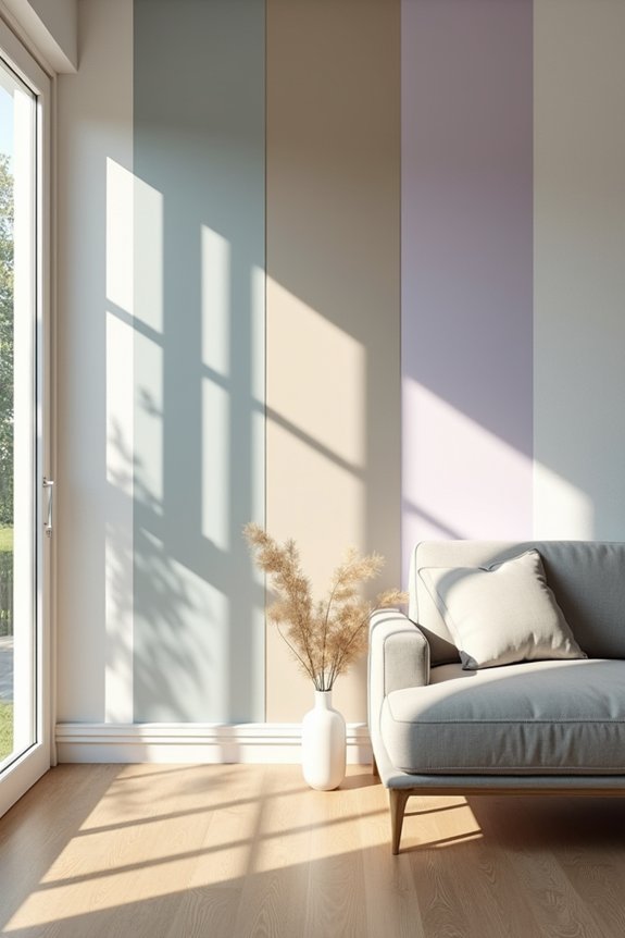
I’ve learned that testing paint colors on your actual walls under real daylight is the only way to see how they’ll actually look in your space. Grab some large sample boards or paint swatches directly on your walls (in inconspicuous spots), then check them out at different times—morning light hits differently than afternoon light, and you’ll spot how the color shifts throughout the day. Take photos at various hours so you can compare the undertones next to your furniture and floors without second-guessing yourself later.
Natural Light Assessment
How your living room’s light changes throughout the day will affect your color choice.
Natural light shifts dramatically depending on your room’s exposure and time of day. I’ve learned this the hard way. Here’s what you need to assess:
- Southern and western exposures create cooler-appearing colors
- North and east lighting actually warms up tones
- Direct sun can wash out saturated colors unevenly
- Existing furniture and carpet reflect light onto walls
- Swatches need several hours of observation
Test your color samples at different times—morning, afternoon, and evening. Notice how the hue changes under bright versus indirect sunlight. Your nearby surfaces matter too. That beige sofa? It’s casting its own light onto your walls, shifting how you’ll perceive your chosen color permanently.
Sample Testing Throughout Day
The paint color you love at the store often looks completely different once it’s on your wall at home—and that’s not a mistake on your part. Light shifts throughout the day, changing how you perceive color.
Here’s what I recommend: grab sample pots from your paint store and apply them to your actual walls. Testing these swatches in morning, midday, and evening light shows you the real picture. Watch how direct sun hits them. Notice shadows too.
This matters because your carpet, furniture, and existing textiles interact with paint differently depending on the hour. A shade that looks good at noon might feel off at sunset. Spend a few days observing. You’ll spot patterns. That’s when you’ll know if a color works in your space.
Grounding Greens for Calm and Balance
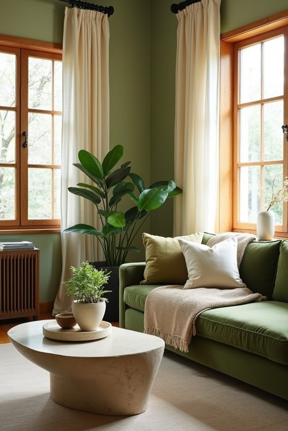
Green’s got real power in a living room—it naturally calms your mind and helps you feel grounded, which is why I’m drawn to shades like Bancha No. 298 and De Nimes No. 299 for creating that serene foundation. You’ll want to consider Estate Emulsion or Estate Eggshell finishes in these verdant tones, as they give you that soft, durable look with subtle texture that supports the space well. Pair your chosen green with natural textures—wood, linen, plants—and muted neutrals, then layer in warmer accent colors once your green base is established.
Green’s Psychological Impact
When you’re looking to create a living room that actually feels like a sanctuary, grounding greens offer something special—they stabilize your space and your mind all at once.
Here’s what makes green work so well psychologically:
- Green reduces mental fatigue and promotes relaxation through natural associations
- Colors like Bancha No.298 and De Nimes No.299 anchor your room with calm consistency
- The color supports focus without demanding your attention (perfect for unwinding)
- Green pairs seamlessly with soft neutrals, creating balanced visual harmony
- Using green as your foundation lets you adjust accent colors based on your mood
When I paint with these greens in Estate Emulsion or Estate Eggshell finishes, I’m not just choosing a color—I’m investing in how I’ll feel every time I step into that room. Your living room becomes the refuge you actually need.
Popular Verdant Paint Options
So how do you actually choose between green options that all promise calm? I’ve found that pairing Bancha No.298 with De Nimes No.299 creates green filters that soften your entire living room. Here’s what works: use Estate Emulsion for walls and Estate Eggshell for trim. This combo keeps your color consistent everywhere, which makes the space appear deliberate rather than random.
These greens aren’t trendy—they’re grounding. They anchor furniture without demanding attention. You can layer botanical textures and neutral accents around them without clashing. The stabilizing effect means your room won’t feel chaotic when you rearrange things (and let’s face it, we all do that).
Stick with these proven pairings, and you’ll create a cohesive space that works as home.
Pairing Greens With Décor
Green tones create a natural foundation that pairs well with specific décor choices. Here’s what works:
- Botanical textures like linen curtains or woven throws echo the natural vibe
- Wallpaper accents featuring leaf patterns reinforce that calm atmosphere
- Wooden furniture in warm tones complements deeper greens without competing
- Cream or soft beige upholstery balances bolder green walls
- Metal accents in brass or bronze add subtle sophistication
The key? Let your green walls be the anchor. Layer your accessories around them rather than fighting against that calming foundation. You’re creating a space where everything belongs together naturally.
Go Bold With Inky Blues for Drama
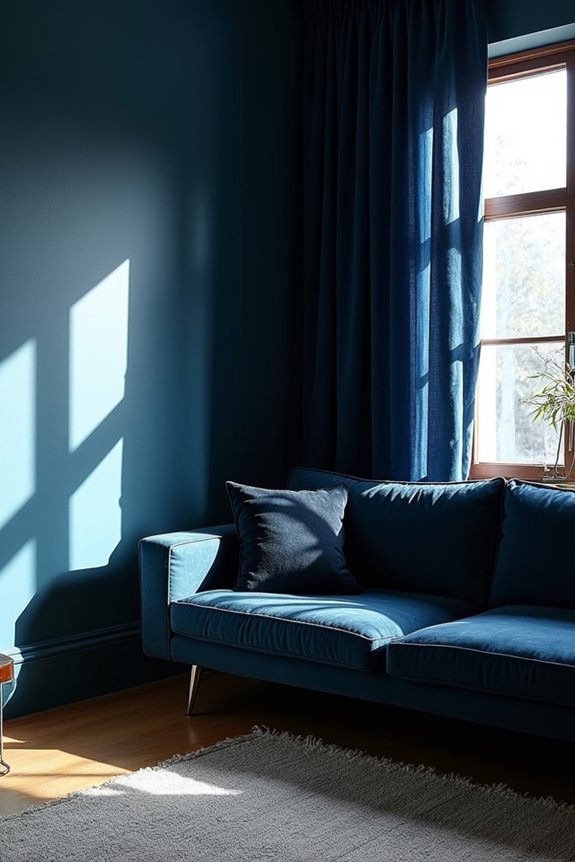
Why settle for safe beige when you could consider inky blues like Black Blue No.95 for your living room? These dark, sophisticated tones work well for evening gatherings and create a moody atmosphere. Pair Estate Emulsion on walls with Estate Eggshell on trim to build real depth and contrast.
Balance these bold blues with lighter neutrals to keep your room from feeling too heavy while maintaining that polished, intimate quality. Blue-gray tones like No.91 offer another sophisticated option if pure inky blue feels too daring.
These colors work particularly well if you want your living room to feel like a personal retreat—a place where conversations matter and design choices are deliberate. You’re not just painting walls; you’re establishing a specific mood and atmosphere.
Timeless Whites and Soft Neutrals
If you’re looking for a living room color that’ll work with practically anything you throw at it, timeless whites and soft neutrals are your answer. These living room paint colors create versatile backdrops that adapt to your style changes without complaint.
What makes them so reliable:
- Warm whites like Dover White or Snow on the Mountain create cozy, hygge-inspired spaces
- Cooler whites maintain a crisp, modern aesthetic that feels fresh
- Neutrals such as White Dove OC-17 and Revere Pewter HC-172 balance warm and cool lighting
- Soft neutrals allow easy seasonal refreshes with new accent colors and textiles
- Pairing these bases with natural textures or greenery adds depth without overwhelming
You’re building a foundation that lets you experiment freely while keeping everything grounded.
Rich Jewel Tones and Saturated Statement Colors
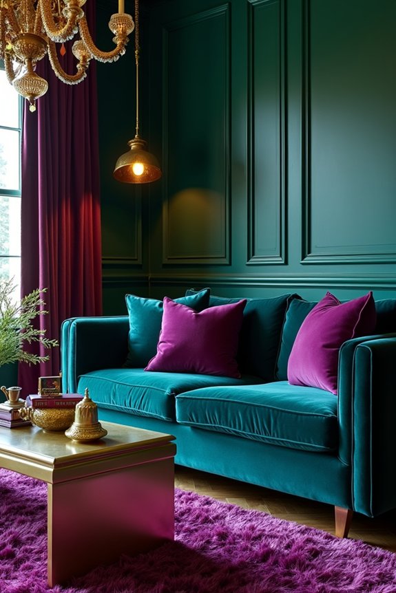
Ready to make your living room memorable? Rich jewel tones deliver exactly that punch. I’m talking deep blue, emerald, and amethyst—colors that demand attention without screaming for it.
Here’s what works: pair these saturated hues with metallics or dark trims. This combo creates luxury through contrast. Navy and indigo offer moody sophistication, while emerald brings regal elegance that makes you feel like you belong somewhere special.
Don’t paint everything jewel-tone. Feature walls, cabinetry, or accent pieces work best. Balance bold colors with neutrals so your space stays inviting, not overwhelming.
One practical tip: matte or satin finishes preserve color depth better than glossy options. Proper lighting matters too—it prevents glare from dulling those gorgeous tones you’ve chosen.
Dark Teal for Otherworldly Sophistication
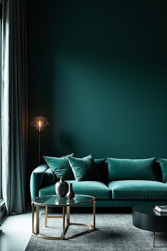
Dark teal creates a moody sanctuary—a color that balances calm and drama in a single application. This rich hue brings otherworldly sophistication to any room with genuine visual impact.
Dark teal works across multiple applications:
- Paint doors and trim for striking contrast against lighter walls
- Apply to cabinetry for depth and visual interest
- Use on accent walls to set your room’s mood
- Pair with premium interior paints for durable, high-end finishes
- Choose from Gentleman’s Gray 2062-20, Tucson Teal 2056-10, or Pacific Rim 678
The green undertones in these teal shades prevent coldness. Instead, you’ll achieve a sophisticated atmosphere with genuine presence. This color choice signals thoughtful design and willingness to make bold statements.
Pick the Right Paint Finish for Your Space
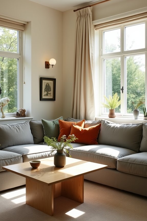
While dark teal brings the mood you’re after, the paint finish you choose is just as important as the color itself—it’ll actually change how that teal looks on your walls. I’d recommend matte finishes if your living room gets strong natural light, since they reduce reflections and soften the overall appearance. Here’s the thing: finish affects how bright or moody your space feels. If you want lasting color depth and a quality look, Aura Interior delivers impressive performance. For high-traffic living rooms, Regal Select Interior offers durability and easy cleanup when the inevitable spill happens. The right finish balances what you see with what you need practically. Pick one that matches both your color vision and your lifestyle.